Audi: a booking platform and 32 production Feature Apps
Booking time cut by about 80%, and 32 reusable apps delivered on schedule inside a global design system.
- Client
- Audi Business Innovation, via Modus Create
- My role
- Senior Product Consultant (UX design)
- Team
- One agile release train (SAFe, three-month program increments, two-week sprints). Eight people: Audi proxy owner, product manager, four engineers, QA, and me as the only UX designer
- Timeline
- December 2020 to late 2022
Part 1: Driving Experience booking
Booking an Audi Driving Experience meant downloading a PDF, filling it in, sending it by post, waiting for a phone confirmation, and paying after an invoice arrived. Research showed the PDF was a visible drop-off point and Audi was losing leads. There was no digital option for the younger audience the program wanted to reach.
The problem was global, with Audi’s German site as the first market. The program targets premium-class customers and automotive enthusiasts, in a range from a short experience with a specific model to a bespoke event.
The goal was a global web platform to discover and book events by type, location and date, integrated with the MyAudi login, Audi’s payment platform and customer support. Constraints were real: other teams owned the parent page and payments, every integration needed approvals, and the UI was limited to Audi’s component library.
How we got there. Stakeholder interviews confirmed or corrected our hypotheses and showed who to focus on and who to deprioritize, alongside funnel analysis, a data analysis report, competitive analysis and Statista data. A consumer journey map and service blueprint covered the whole service, with dot voting to prioritize and task-analysis flows to estimate effort. A first prototype was built in Sketch and tested internally with Audi.
Decisions
- Map the whole service before drawing screens.A consumer journey map and service blueprint covering front end, back end and third parties exposed risks and dependencies early and made deliverables easier to agree with the product owner.
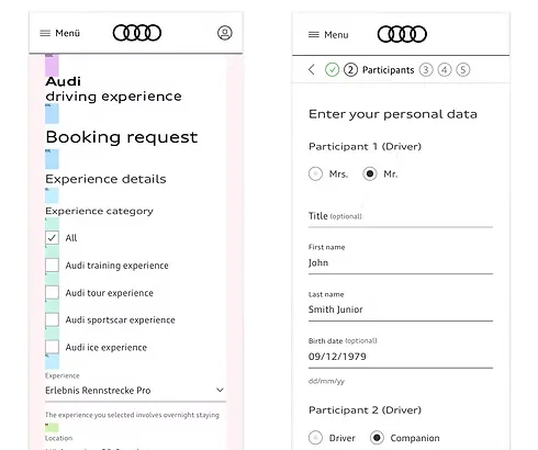
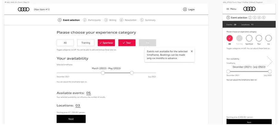
- Simplify a search that had about 2,000 possible combinations.The client wanted three interconnected entry points (location, date, experience type), with filter checkboxes adding a fourth layer. Picking an experience whose dates did not fit meant resetting everything. We reworked the selection logic and flow.
- Split the mobile form into steps.Internal usability tests showed the mobile booking form felt endless. A stepped flow replaced the infinite scroll.
Handoff and after launch
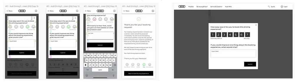
We handed over every screen plus the edge cases: 404 page, confirmation and validation emails, share screen, notifications and errors, adapted to Audi’s required breakpoints in Zeplin. After launch we added three in-flow surveys (CSAT, effort score, NPS) to catch drop-offs in real time alongside Audi’s monthly analytics. Audi’s design system had no survey component, so we designed one and sent it to the Design Ops team for approval. I worked with the developers and with QA through implementation, and we kept refining after launch, reviewing Audi’s monthly analytics reports over the first six months.
Result. Booking time fell by about 80% compared with the offline process.
Part 2: oneAudi Feature Apps
oneAudi was the shared experience layer for Audi’s digital touchpoints, built on the idea that to stay relevant as a carmaker you have to stay relevant as a digital player. Customers were moving between disconnected sites with inconsistent UX, no contextual relevance and no shared view of their behavior. The aim was modular, composable pieces of interface that content authors and developers, inside and outside Audi, could reuse and eventually personalize.
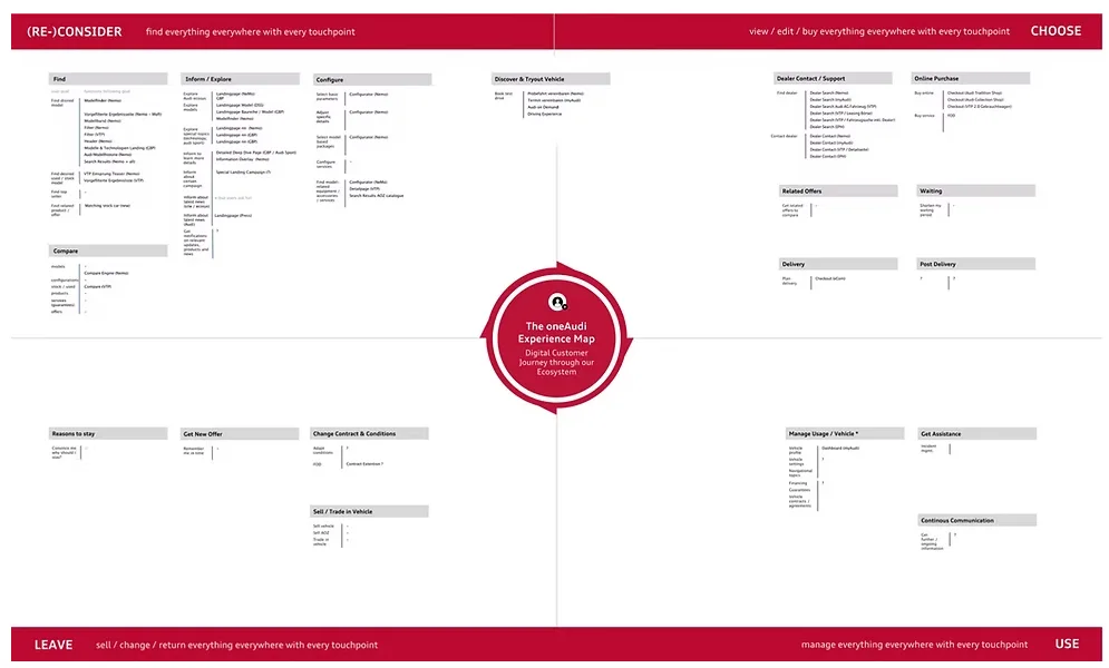
Alongside the strategy work (the experience map, the core component library and the information architecture) I designed Feature Apps: modules, templates and complex components such as headers, editorial teasers, document renderer and country selectors. Each was built to Audi’s layout system, responsive from phone to wide desktop, light and dark themes, and WCAG 2.1 and ARIA. I also wrote design and developer documentation for each app, like a user manual.
Result. 32 Feature Apps designed and released to Audi’s internal app marketplace over two years, all within committed timelines. Accessibility pushback came up when components overlapped, which we handled through the acceptance criteria.
What it taught me. In a restricted environment, excellence means delivering reliably inside the rules. It also cost something: scaled agile meetings took roughly a third of my week, and custom components needed weeks of approval. That is why I now set up design systems to make the right choice the easy one. On the positive side, I had access to a community of over 70 design experts across the globe, applied almost every UX method in the book for the first time, and knew my work would reach potentially millions of users.