Devensoft: finding out why a powerful M&A platform was hard to adopt
Five weeks of research and audit. Days after the final report, the client signed a one-year extension with a designer and a researcher assigned full time.
- Client
- Devensoft, B2B M&A and deal management software
- My role
- Senior Product Designer, via Modus Create
- Team
- 2 UX researchers, 1 product strategist, 1 delivery partner, me as the product and UX designer
- Tools
- Miro, Slack, Figma, Dovetail
- Timeline
- 5 weeks, March 2023
The problem
Devensoft’s platform is flexible but heavy. New users needed between 6 and 9 training sessions just to understand and set it up, the interface was inconsistent, and public reviews described it as seamless once you know the order of operations but not intuitive.
The brief had two parts: surface problems the client might have missed, and, if given a free hand, show how the platform could improve. The client’s VP of Engineering, VP of Partnerships, Director of Product and Principal Solution Architect were involved throughout.
My part. I ran the market and competitor analysis, the UX teardown, information architecture and user journeys, co-facilitated workshops, and designed the concept mockups. Research and product strategy were led by my colleagues. I also sat in on the object-oriented UX system-modeling workshop, led by our strategist and an OOUX-certified researcher, to build knowledge in the method.
Three decisions that shaped the work
- Agree what not to touch before starting.A goal-alignment workshop set success measures and non-goals up front. That protected the five weeks from scope drift and showed which parts of the platform the client wanted handled with care.
- Throw out our first interview sample.The first sessions were with very experienced users who could no longer see the problems. No pattern appeared, so we recognized the sample was wrong, widened it, and ran 12 to 15 interviews across three user types (executives, project managers, administrators) in two weeks. The experienced users’ input still became useful later.
- Offer two paths, not one redesign.The client had doubts about a full overhaul, so we presented a low-risk option and a bolder concept instead of forcing a choice.
What we found
Object-oriented UX modeling, a competitive review and a heuristic evaluation pointed to four themes: mental model, navigation, ontology and interface. Most usability issues sat in consistency and navigational clarity, how much users had to remember, and information architecture. The top navigation was crowded and used labels that did not match how users think about their work. File management was well behind competitors. I mapped user flows and task scenarios for three user types (executives, project managers and administrators) so that information followed a logical sequence with less friction. The experienced users also gave useful input, such as a wish for more dynamic reporting.
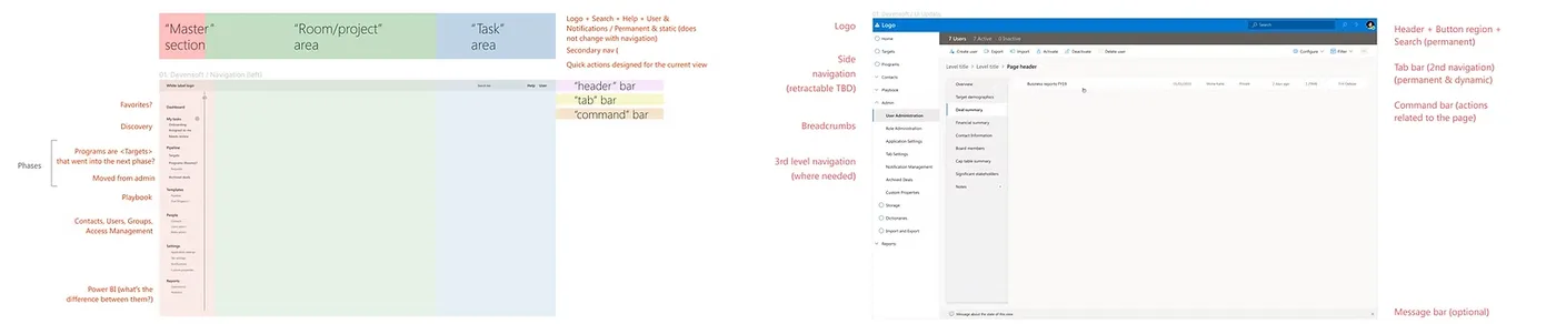
Two options we presented
Option 1: quick wins
Left-side navigation, a reconfigured menu, and an onboarding phase with videos to cut the number of training sessions. The visual style borrowed from the Microsoft tools users already worked in, which research showed were close to their mental model.
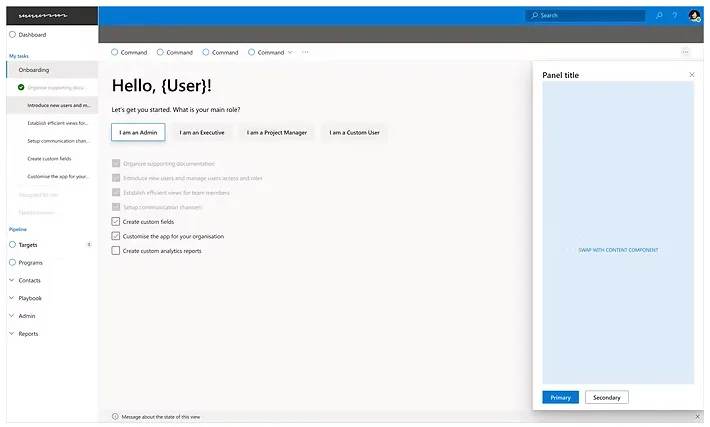
Option 2: a new concept
A cleaner interface built around the findings, with simpler flows for complex tasks.
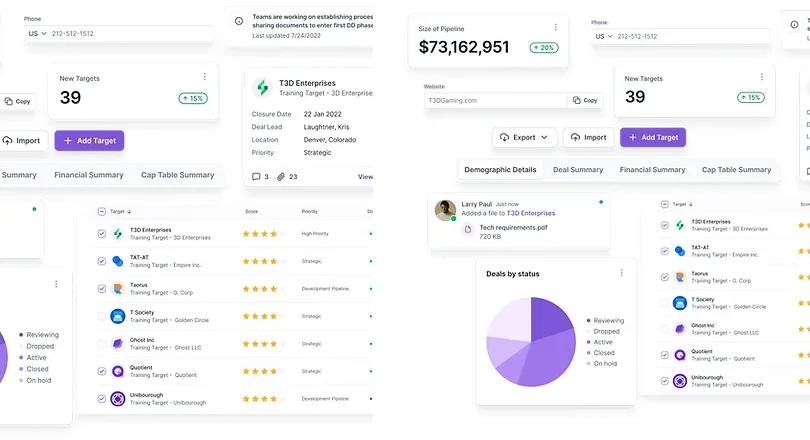
Result
We delivered four things on a Thursday afternoon: a modernization recommendations report, a gap analysis from current to ideal state, a UX research report and a heuristic evaluation, alongside product strategy findings on mental model, navigation, ontology and interface. The feedback was overwhelmingly positive, and by the following Monday Devensoft had signed a one-year extension with one UX designer and one researcher assigned full time.
The client said the work validated their initial hypotheses and also surfaced needs their users had not voiced. For me the hardest part was understanding a practice I don’t usually come across, M&A, and learning a counter-intuitive platform with a steep learning curve well enough to design for its users.
What I would do differently. I’d screen interview participants for experience level from day one, since that mistake cost us a day. I’d also publish the heuristic evaluation findings, which I left out here for scale.